
Epoch Solutions: Logo Rebrand
A Fresh Start
Today I want to talk about a recent logo project CG Design had the privilege of working on with Buzzadelic (a digital media content agency) for a one of their clients, Epoch Solutions. You can read more about them here. The idea was to take their current logo (shown above) and redesign it so that it tells exactly what their product or service is. Although, the logo is not a bad looking design, it doesn’t tell their potential customers what they do other than something with recycling/up-cycling.
“A logo needs to symbolize what product or service your company is providing to your target audience in a clear and concise way.
Take a look at these well known logos and you will see how hidden symbolism is used in creating an effective logo. Can you see the hidden symbols within them? Check out the link to see if you were able to.


Initial Design Mockups
Let’s look at redesign how to apply it. We want to use the current logo idea and sort-of revamp it so communicates the right idea to consumers. CG Design took the current logo and came up with several designs comps to convey what Buzzadelic believed the client needed to reach their target audience. The first idea was simple (and those are usually the most effective), but you need to provide comparable designs so that different ideas and visual communication can be weighed out. Buzzadelic also mentioned that they wanted this design to be something that could possibly be debossed on their clients product line. Take a look at the designs below. Minus the color in the first one, which one speaks to you and why? You need to ask yourself these questions as if you are a consumer.
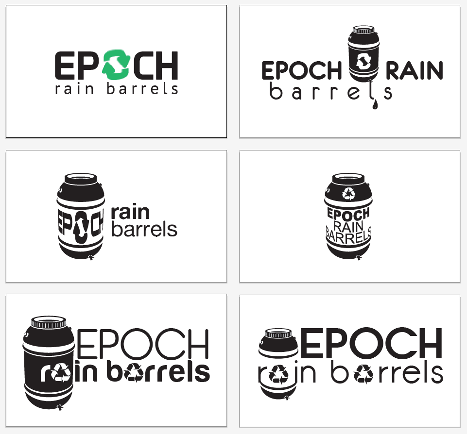
While I’m not going to comment on every one, I would like for you to see the overall idea of what is being conveyed through these designs. Can you look at each one and tell what the product is or at least some reference that may get your attention? The words “Rain Barrels” alone solve that and if you are going “Green” you may be interested in what this product has to offer. Even creating some curiosity through the design, you can draw interest from consumers who want to find out more. As you can see these are all in black and white (other than the first design). There is no need to confuse the clients with tons of colors and effects. A rule of thumb taught to me by one of my art teachers, it that if it works in black and white, it will work in color. It also will save you time as a designer when only one design may or may not be chosen. Once the designs have been narrowed down to a few you can then compile them with different color pallets or effects if necessary.
“Remember to…KEEP IT SIMPLE!”
The Chosen One
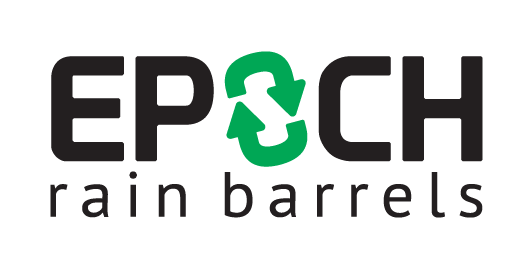
Looking at the designs you can see a common theme. A barrel shaped is used as a prominent image in the logo. I don’t know if you noticed on the original logo, but the recycle/up-cycle image is actually in the shape of a barrel. So why not use the hidden symbol within the redesign? You don’t need to reinvent the wheel on a redesign, especially if the client budget doesn’t allow for it. Using the recycle/up-cycle shape with some tweaks and replacing the “O” in Epoch shows the hidden symbol of what the product is, recycled/up-cycled barrels. This was the one that our client Buzzadelic chose to represent the new face of their client brand. Although it was the first design and the most simple, it isn’t always the easiest to come up with. Working with BJ Emerson, CEO of Buzzadelic really helped to nail down what they were looking for. It’s helpful to have someone that can provided direct ideas of what they are looking. It’s just up to you as a designer to implement them effectively.
The Final Product
Take a look at the final logo. Very clean, simple and effective. It conveys the name of the company, the product they are selling, that’s it’s recycled/upcycled and a hidden symbol within the center shape of their product. It hits all the major the points of a good logo design. This is essentially a very effective logo redesign.
Adding Some FX’s
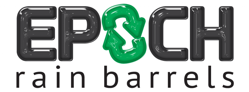
If you want to take your design a little farther you can then import your it into Photoshop and add some nice effects. I chose to actually make the logo resemble plastic. This is the same material that the product is made of. Although the effect looks great. The client decided to stay with the logo above for their re-brand. A simple drop shadow can be added without affecting the overall design if there needs to be some more depth.
Let me know what you think of this logo design. Share your comments or any questions you may have. I hope you enjoyed the read!